Carlisle banner
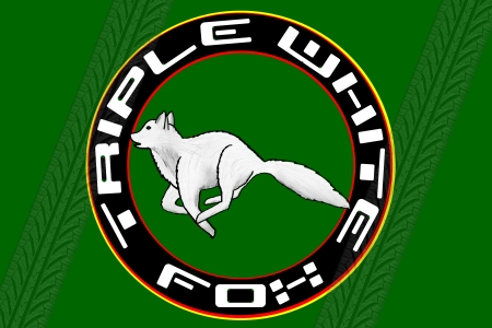
This year one of the Carlisle policies for having a club tent requires having a banner. Not a bid deal but the problem has been getting the inspiration for a design. I want to do something different but also not too specific as my plan is to hang it in my garage after the show and to possibly reuse it in the future for other events. My inspiration thus far has led me to this:

At this small size some of the refinements that are still required are not noticeable. The final print size is going to be 42″w x 28″h.
You may have noticed that the font I use for the twf.com logo at the top of every page is derived from the font used for “Mustang” in the fox body era. I had originally done the font a long time ago in software I no longer have a license to and thus cannot access the source file in its native format. This time around I needed it to scale larger (each character will print at about 4″ x 2″) so I really needed that source. Unfortunately, I had to use my current graphics software and recreate the font from scratch!
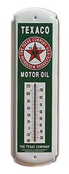
The banner uses the same green as this site which has sort of become the “classic” color for the site and all things related to it. The addition of red and yellow bands around the ring join the white and green to represent (roughly) the colors of all of the feature cars. The circular logo was inspired by a gift given to me by a friend just this week. The gift was given for my garage and is a Texaco thermometer. It uses a classic round logo with the star on the inside. Writing is present around the ring.

My green background seemed too plain so I was browsing looking for banner ideas and found a discussion on using a tire tread as a photoshop brush. One recommendation to someone looking for such a brush was to create their own. I thought, “I could do that.” And, I did. I used the same tread pattern as is on my current set of tires. The tracks overlay the rings but not the white font.
I have more tweaking to do but I’m getting closer. I’d love to hear your thoughts on it and how I might improve it.
I really like it!! We are going to look like a top notch club!!!
Really looking forward to the show!!
Nice banner. I just noticed the X in Fox looks like an H to me though.
Is it my eyes or is there something happening?
The banner looks sharp. Enjoy the event.